
Appreciation of art is not something too common to come by. However, when you do come across a die-hard aficionado of art, they will surely examine everything about your art work in detail – from the work you do, to the fine details like your logo. Whether you’re a musician, photographer, graphic designer, sculptor or a fine artist, having the right logo is the first start to gaining recognition for your artwork as that’s the first thing people will see to assess your creativity before listening to or looking at your work.
In a nutshell, you must have a creatively designed art logo to represent your work and its quality. Some of the best examples that could be found have been laid out below:

Right from getting started with your idea of an art logo to coming up with a final design take up hours of thought process and hard work. These tips will help ease out the process for you and give you some direction vis-à-vis the flow of the designing process.
Since these are art logos we are talking about, there is absolutely no limit to the color palette you can use. The only limit one could think of is the genre of art work you are into. For instance, if the logo of a pop music band is under consideration, then using sedate colors may not be a very good idea, and bright tones, especially red, will be a great choice. However, if the logo being designed is of a sophisticated art gallery in Paris, then the use of sober colors in the logo will be more representative of the sophistication rather than a neon green theme in the logo.
Instead of using a plain text style that is laid out in a straight fashion, stylized font styles make art logos appear most appealing. Even if you use a traditional font style in order to reflect a more cultured piece of art, an elegantly curvy font style, or even a traditional style similar to something like the Algerian or Times New Roman with styling elements such as thickened text will do wonders. The key is, not to leave it plain and uninteresting.
Although there are many well-known artists who do not have images with their logos (and that works perfectly fine too), if you do include a symbol or image with your logo, ensure that it’s complementary and not something totally out of sync with your art work. A sculptor, for instance, should avoid a CD or a paintbrush in his/her art logo (unless CDs and paintbrushes are the focal sculptures he/she’s creating). Similarly, a painter or an art gallery can have the symbol of a canvas, a photographer can include a camera or a strip of photo films, etc. to more clearly indicate their lines of work. Or simply the artist’s own name.
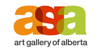
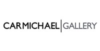
Often, looking at the work of other famous artists can give you a lot of ideas and inspiration for getting started with your own art logo. Here are some famous logos of, the Art Gallery of Alberta and the Carmichael Gallery in LA, California.
Since the product being presented is a work of art, there has to be something in the logo that makes it stand out from the crowd. It could be in the form of a uniquely styled alphabet in the text of the logo, or a symbol that has been creatively designed to show a special piece of work. For instance, a photographer could include a symbol which represent of one his most recognized works in his logo. The point is to keep it unique such that it speaks highly of your work.
Of course, copying or imitating somebody else’s logo is a big no-no. But that alone is not enough. DO something which is different from the rest, something that makes your logo outstanding. As an example, if music logos usually have CDs or the music sign in them, go for a guitar with a contemporary twist to it, or have a CD cover done with musical notes with an off-beat touch to make it different.
Artists and logo designers often make the mistake of creating only one logo and working too hard to tweak that around. A better idea would be to design at least 4-5 options, even if rough drafts of the same, and then choose the best ones after much deliberation.
The better the quality of software you use, the better will be the outcome of all your logo designing efforts. There are many great logo designing software available in the market to choose from. To save yourself much time and effort, you can also use DesignMantic’s logo design maker to create some really unique and outstanding art logos for your brand. With these tips, there will be nothing that can stop your art logo from being one of the best ones out there.